Quantified Self Interview

Published on Saturday, July 27, 2013

YS and I were recently interviewed about self-tracking and Quantified Self by one of the major news channels in Australia. I will reflect on the experience after the show has aired, but it was an overall great experience. We have a new respect for filming what may ultimately be just a two minute segment. Depending on how the editing is done it will either provoke the hosts to contemplate the value of a data-centric macroscopic view of the world, or give them lots of fodder.

That said, as you would expect, I had to track my heart rate during the interview - see below. My interpretation is that my heart rate jumped at the start of every questions, and went down as I answered the question. It also dropped when the interview finished. I wish I had a more expensive heart rate monitor (e.g. Zephyr BioHarness or Scanadu) that tracked skin temperature and breathing. My hands felt cold by the end.
.

Coffee, Beer, Wine and Time of Day

Published on

One of the things I like Tableau, a piece of software to visualise data, is that it aggregates on dates really well. Below is a spread of beer / wine / coffee over 18 months, but grouped by what hour is fell in. You can see some trends, like I usually consume coffee in the morning, and that I usually drink after 17:00. There are exceptions, of course, like that beer I had at 10AM, and that coffee I had at 1AM.


Some QS Numbers

Published on Thursday, July 25, 2013

There is the possibility I will be giving an interview on the Quantified Self "movement". What follows is a brief summary of QS, the things I track, and some pretty charts.

What is Quantified Self

I suppose it depends on who you talk to. Wikipedia states that it is "a movement to incorporate technology into data acquisition on aspects of a person's daily life in terms of inputs", but I side more on the idea that the movement is "a collaboration of users and tool makers who share an interest in self knowledge through self-tracking." It is at this point that it is probably important to interject that most people are self-trackers: weight, height, reps at the gym, hours worked, and so forth. If you have ever made a goal, you probably tracked how you could reach it. What makes us QS folk a bit different is that we tend to track lots of things, correlate between them, and share our results. So, with this theme, let me share what I track.

What I Track, and How

This is a list of some of the things I track, and the tools I use to do so.

  • Weight / Body Fat / Temperature / Measurements -> scales, callipers, ear thermometer
  • Resting Heart Rate -> oximeter
  • Drinks (wine, beer, coffee – and previously water) -> Android app (bespoke)
  • Drugs and vitamins -> Android app (bespoke)
  • Various conditions (headaches, “colds”, itchiness, nausea, sore throats, “the runs”) -> Android app (bespoke)
  • Finances (family) -> Android app (TOSHL)
  • Start/Stop times of work -> Excel…
  • Mood (Terrible to Great) -> Android app (How Are You Feeling)
  • Indoor air quality (not really QS) -> various sensors
  • Computer activity (Keystrokes / mouse clicks / mouse movement) -> WorkRave
  • Location -> Google Latitude
  • Steps & sleep -> Fitbit
  • Fitness --> Android app (Sports Tracker) and a Zephyr Bluetooth Heart Rate Monitor
  • Health History -> Microsoft HealthVault
  • Photo every day -> Android app (PhotoChron)
You can see that this list seems utterly normal, but still gives me enough to work with to start forming a macroscopic view of life.

A Few Charts

I created these using Tableau, a fabulous piece of software for putting meaning behind numbers. These are not good examples of what the software is capable of, but it is the quickest way for me to visualise them.

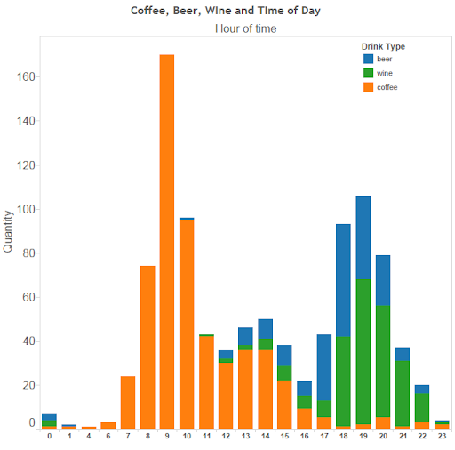
I like coffee. It is, in all honesty, a drug. There have been times (I could probably find the date!) when I went from two cups a day to none, and I had withdrawals (headaches and nausea). I track the amount of coffee I consume to remind myself to not get into the habit of having two cups/day for too long. It is also bad for my stomach.

If I chart the days of the week I like to drink coffee over the last 18 months, it turns out I drink the most amount of coffee on Saturday


 I also enjoy an alcoholic drink from time to time, but was told in January to cut back (for my stomach's sake).


I track both beer and wine consumption. I have managed to cut back on wine, but not so much on beer.


This can be explained because I tend to have beer when I go out with work colleagues or friends, but wine at home. It appears to have been easier to stop drinking with dinner than when out.

For the last two years I have been wearing a FitBit, usually, and using it to "track" my sleep.


It looks like I averaged about 7500 steps/day, yet started walking more in January of this year. Walking more was not a New Year's Resolution. In May I broke the clip to my FitBit, but a friend was kind enough to give me their's as a replacement. I should walk more.

I should also sleep more. It appears as though maybe, just maybe, I am starting to sleep more. My average is about 7.5hr/night. This is one area I would like to experiment more with.


I have also started tracking happiness on a simple Terrible -> Great! scale.

This graph shows my average happiness on a weekly basis for the last ~8 months. We could conclude that I'm getting more happy, and was really unhappy around Christmas.


And here we have my happiness levels when grouped by day of the week. We could conclude that I am, on average, the most content on a Sunday. I would like to believe it is just a coincidence that I am most content on a Sunday, and drink the least amount of coffee.


This is the standard deviation of my happiness tracking on a monthly basis. It looks like I am also getting less moody.


And finally, weight. Nothing interesting here. I need to get back down to 77KG, which is a more natural weight for me. I use a normal scale so only record every few months - if I had a wi-fi scale, I would be able to record much more frequently. 


Final Thoughts

In the last ~18 months I have become more happy and less moody, with Sunday being my happiest day, and Monday and Wednesday being my least content. I have put on three KG. I drink the most amount of coffee on Saturday, the least amount on Sunday, and have been able to drink less wine, but keep drinking the same amount of beer.

By looking at this evaluation I know I should probably start to incorporate a lunchtime walk into my daily routine, and stop drinking coffee on one day of the weekend. I should also drink my beer at a slower pace when I'm out, as this will prevent me from buying more than one, or, even harder to resist, friends and colleagues buying it for me.

Finally: I know none of the charts have a title. Read the text.

Sydney Commute Times Mapped Part 1

Published on Sunday, July 21, 2013

I quite like open data. I like data based on open standards (or mostly open standards) even better. Many transport operators around the world have started releasing their timetable data using (mostly) open standards, e.g. GTFS. One of the nice things about using a standard is that clever people have created tools to work with the timetable data, and those tools can now be used to manipulate timetable data from hundreds of agencies. The magnificent OpenTripPlanner is one such tool, and it works well with 131500's GTFS data.

New South Wales Planning & Infrastructure have released a draft plan for how they hope to shape Sydney's growth, which is where they detail the idea of a "city of cities". I thought it would be interesting to mash these smaller "cities" with 131500's transport data, and then display a map with the shortest commute to the nearest city. Various cities, I believe including Melbourne, have goals of re-achieving a "20-minute" city, or something similar (i.e. X% of the population can reach X% of the city within X minutes).

This map is the first stage. It only displays the commute time to St Leonards from every Mesh Block in the greater Sydney area. I used the open source tool OpenTripPlanner to computer the commute times, with OpenStreetMaps to support walking distances. The next map I release will probably have all the regional cities, and a similar styled map depicting time to nearest "centre".


Mapping Mesh Blocks with TileMill

Published on Saturday, July 20, 2013

This quick tutorial will detail how to prepair the ABS Mesh Blocks to be used with MapBox's TileMill. Beyond scope is how to install postgresql, postgis and TileMill. There is a lot of documentation how to do these tasks.

First, we create a database to import the shapefile and population data into:


Using 'psql' or 'SQL Query', create a new database:

CREATE DATABASE transport WITH TEMPLATE postgis20 OWNER postgres;
# Query returned successfully with no result in 5527 ms.

It is necessary to first import the Mesh Block spatial file using something like PostGIS Loader.


We then create a table to import the Mesh Block population data:

CREATE TABLE tmp_x (id character varying(11), Dwellings numeric, Persons_Usually_Resident numeric);

And then load the data:

COPY tmp_x FROM '/home/kelvinn/censuscounts_mb_2011_aust_good.csv' DELIMITERS ',' CSV HEADER;

It is possible to import the GIS information and view it in QGIS:


Now that we know the shapefile was imported correctly we can merge the population with spatial data. The following query is used to merge the datasets:

UPDATE mb_2011_nsw
SET    dwellings = tmp_x.dwellings FROM tmp_x
WHERE  mb_2011_nsw.mb_code11 = tmp_x.id;

UPDATE mb_2011_nsw
SET    pop = tmp_x.persons_usually_resident FROM tmp_x
WHERE  mb_2011_nsw.mb_code11 = tmp_x.id;

We can do a rough validation by using this query:

SELECT sum(pop) FROM mb_2011_nsw;

And we get 6916971, which is about right (ABS has the 2011 official NSW population of 7.21 million).

Finally, using TileMill, we can connect to the PostgGIS database and apply some themes to the map.

host=127.0.0.1 user=MyUsername password=MyPassword dbname=transport
(SELECT * from mb_2011_nsw JOIN westmead_health on mb_2011_nsw.mb_code11 = westmead_health.label) as mb


After generating the MBTiles file I pushed it to my little $15/year VPS and used TileStache to serve the tiles and UTFGrids. The TileStache configuration I am using looks something like this:

{
  "cache": {
    "class": "TileStache.Goodies.Caches.LimitedDisk.Cache",
    "kwargs": {
        "path": "/tmp/limited-cache",
        "limit": 16777216
    }
  },
  "layers": 
  {
    "NSWUrbanDensity":
    {
        "provider": {
            "name": "mbtiles",
            "tileset": "/home/user/mbtiles/NSWUrbanDensity.mbtiles"
        }
    },
    "NSWPopDensity":
    {
        "provider": {
            "name": "mbtiles",
            "tileset": "/home/user/mbtiles/NSWPopDensity.mbtiles"
        }
    }
  }
}

Mapping Urban Density in Sydney

Published on

Five years ago I started exploring different mapping technologies by detailing instructions on installing Mapnik and mod_tile. Times have changed significantly in the last five years, and thanks a lot to the products offered by MapBox. After playing with TileMill, MBTiles, Leaflet and UTFGrids, it is great how many annoyances have been fixed by MapBox. I find it enjoyable making maps now, as I no longer need to worry about patching code just to get it to run, or mucking about with oddities in web browser.

Each night this week I have created a new map using Mesh Block spatial data from the Australian Bureau of Statistics (Mesh Blocks are the smallest area used when conducting surveys). I am thankful to live in a country that provides a certain amount of open data, and the ABS should be applauded for the amount of data they provide. They provide spatial data about Mesh Blocks, as well as population counts for this spatial data. It is relatively easy to merge the two and then visualise them using TileMill.

First up - population density of Sydney, i.e. persons reported to be living in each mesh block. Darker red indicates a higher population count.


View Full Screen

I find it interesting to see how many people live in certain Mesh Blocks. You will notice that Mesh Blocks with high population levels tend to be nearer public transport - either major roads with frequent bus service, or train stations.

We can look at the urban densities by determining dwellings per hectare, and do this per Mesh Block. The definition I used for urban densities comes from Ann Forsyth in "Measuring Density: Working Definitions for Residential Density and Building Intensity" (pdf). Ann discusses the need to consider net or gross densities, depending on the type of land use. At the Mesh Block level the land use type appears to be singular: Industrial, Parkland, Commercial, Residential, and Transport. Because the land use type was generally singular I have not adjusted to gross/net, but still used Ann's definitions of certain density bands:
  • Very low density: 11 dw/ha
  • Low density: 11-22 dw/ha
  • Medium density: 23-45 dw/ha
  • High density: 45 dw/ha
"dw/ha" is dwellings per hectare. I decided to map the four density levels, which can be relatively easily achieved using TileMill. See below for an example.


View Full Screen

You can zoom in and scroll over any Mesh Block in Sydney to find out more. Additional installation information on how I did this can be found on this special page: Mapping Mesh Block Data.